No more black interface in Pixelmator
2012-11-23 22:19:42
Right-click on the black window background area that you are referring to and you will get the option to change it to white or grey. The website is indeed hard to read with the small grey text on a black background. For a splashy website for some retail shop with large text, yes. For a website with lots of text, such as a forum, NO. :-)
2012-11-30 20:13:25
And it's impossible to tell where the boundaries of the palettes are since there's no contrasting border color. That makes it very difiicult to notice if apaletteis partially hidden by another. Either a lighter background or the ability to choose a color is sorely needed.
Being able to right click in the image window to change the background is nice--that should be available for all of the different palettes also. The menu bars should be changeable too since the text is hard to read.
Being able to right click in the image window to change the background is nice--that should be available for all of the different palettes also. The menu bars should be changeable too since the text is hard to read.
2012-12-01 12:26:06
Aperture is black...
After Effects is black, Motion is black, Premiere, Avid, FCP X are black, and there's a good reason for this.
KEEP the black look, or at least keep is as an option :D
After Effects is black, Motion is black, Premiere, Avid, FCP X are black, and there's a good reason for this.
KEEP the black look, or at least keep is as an option :D
2012-12-10 22:57:46
I LOVE the black. Please do not listen ... :)
2012-12-17 04:53:29
Having worked with professional ergonomists for more than a decade, I agree wholeheartedly with users who think Pixelmator's main drawback is the white/grey on black interface. I realise some people like it, but from an objective and research-based viewpoint, it's not a good idea. Since some people do like it, why not just make two (or more) colour schemes that the user can choose from. That ought to make everybody happy.
It's a great piece of software, so I feel it's a shame that some usershave to feel excluded by a fairly extreme interface. I'm in my early 50s and I've worn glasses since second grade, and I get a headache within 10 minutes of using Pixelmator. Then it's back to Acorn or Photoshop.. I'd love to use Pixelmator a lot more, but, let's put it this way; I won't pay for the next upgrade unless there's an option for a black/grey on white interface..
It's a great piece of software, so I feel it's a shame that some usershave to feel excluded by a fairly extreme interface. I'm in my early 50s and I've worn glasses since second grade, and I get a headache within 10 minutes of using Pixelmator. Then it's back to Acorn or Photoshop.. I'd love to use Pixelmator a lot more, but, let's put it this way; I won't pay for the next upgrade unless there's an option for a black/grey on white interface..

2012-12-30 10:14:30
I completely agree with ohrobot and Jon Lovell. The reason for black is a function of contrast. If it was white (or a light colored interface), it'd cause a migraine flare up for me.
That said... dagklingstedt seems to have a fair resolution. I don't care if 50 other color schemes exist for the interface, as long as the current one is available. Do what you will, just DO NOT take away what exists, PLEASE!
That said... dagklingstedt seems to have a fair resolution. I don't care if 50 other color schemes exist for the interface, as long as the current one is available. Do what you will, just DO NOT take away what exists, PLEASE!
2013-02-25 07:46:15
The reason Aperture,After Effects, Motion , Premiere, Avid and FCP are black is that you use them in a studio environment, where the lighting is reduced. I can see a reason for a dark interface in this situation. The problem is some of us work in an open work environment with far brighter lighting, and it's a strain to see the dim details in a normal office environment. Then there are those of us who are older or have reduced eyesight, or those of us who prefer brighter UIs (maybe we came from DTP instead of video production) - either way, the UI should be able to accommodate these users as well. It's not hard to do - but it will damage their hipster cred. ;)

2013-02-25 07:59:40
I think the black interface is great, but the option to switch to white wouldn't hurt, I guess. As long as I don't have to use it ;-)
2013-02-27 00:11:57
Oh, absolutely. I don't really mind it in the app so much, but I'vebasicallylost the ability to read withe text on black. I can't even look at this forum for more than a few seconds without goingcross-eyed.
2013-03-13 12:58:49
i love dark UI's (the first time i saw a discreet logic flame in a dark post room, i was in awe). but, too much is too much. there are practical limits to monitor gamma (even LCDs) that in most cases, cannot discern between black and super dark gray. i had to stand up over my monitor to see that there are tabs on the top of the website pages!
even "black" UI's mentioned above are not black - they are mostly dark gray. even that would be better. and, maybe its just my faulty memory, but i believe previous versions of pixelmator itself were not so dark.
here is another vote for dark gray. but, black - too much.
even "black" UI's mentioned above are not black - they are mostly dark gray. even that would be better. and, maybe its just my faulty memory, but i believe previous versions of pixelmator itself were not so dark.
here is another vote for dark gray. but, black - too much.
2013-03-27 10:26:30
Just speaking up for the anti-anti-darkUI: I think it looks fantastic and don't want it changed! (though I do understand that not EVERYONE has top-o-the-line retina macbook-grade monitors ;)
2013-03-27 12:57:01
@mrspeaker: It's not my retina Macbook that isn't top of the line - it's my retinas! I'm not complaining because I don't like the look, I'm complaining because this aesthetic choice has a strong negative effect on my vision.
This forums are barely usable to me. Reading the text here LITERALLY makes me giddy.
If I could fix my eyes with the click of a button, I would. Until then, I rather hope software developers would take these concerns a little more seriously.
This forums are barely usable to me. Reading the text here LITERALLY makes me giddy.
If I could fix my eyes with the click of a button, I would. Until then, I rather hope software developers would take these concerns a little more seriously.
2013-04-01 06:58:37
I'm afraid i have to agree that Pixelmator's black GUI is simply too black (same for the website, by the way. Have you ever heard of the term contrast?). I believe the theory is that colours are represented better against a dark background. Well dark isn't the same as black. Maybe there's some inspiration in the Final Cut X GUI, which also has a dark theme.
2013-04-02 13:32:33
I ended up paying for an upgrade to the competition simply because Pixelmator's interface was killing my eyes. Love the program, but the dark- on-dark interface combined with the small icons—on a 27-inch iMac they are tiny—make it usable for me.
Obviously, the interface must not be hurting sales, or it would've been changed by now. But count one more voice among the chorus of the disappointed.
Obviously, the interface must not be hurting sales, or it would've been changed by now. But count one more voice among the chorus of the disappointed.
2013-04-04 19:52:02
I totally agree. WAY too tiny UI elements. Can hardly see the text without leaning into the screen. On the toolbars, the UI text is unreadable. And the tools are too tiny also.
2013-04-05 10:31:32
If the UI icons and texts are too small, why not simply decrease your screen's resolution? I for one like it just the way it is on a retina screen set to the second highest resolution.
2013-04-05 14:27:26
"here is another vote for dark gray. but, black - too much."
This.
This.

2013-04-18 02:44:53
I haven'tactually read the thread so sorry if I miss something. I would like to see two simple options for the interface. A "light" (greys and that sort) and "dark" (being the current interface). The light interface wouldn't necessarily be white, but just a lighter grey version of our current dark-only interface. As for the website - it gives me headaches. I feel it should be "greyed up"permanently.
2013-04-18 13:21:28
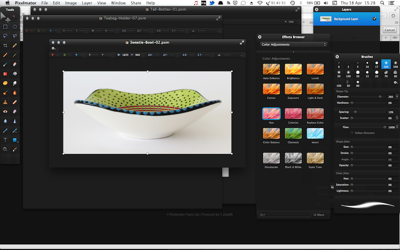
I second making the black interface just a bit lighter. If you have multiple windows over each other it is near impossible to distinguish the window boundaries. I have to angle my Macbook monitor forward just to figure out where one window ends and another begins. This is not good interface design. If you squint a little (for testing purposes, people) or your monitor is angled back a bit and not perfectly 90°, you should be able to make out the window boundaries. Easy to prove, look at the image below squint or angle your monitor back a tad, the near black background just merges.
Still love Pixelmator.
Still love Pixelmator.
2013-04-28 07:18:05
Please keep the current interface.
Just if you should chose to make another color scheme, make this one an option.
i have low vision, but never use my glasses and have no problem with the interface at all. I really like that I can turn the light up and down anyway I want on my screen to compliment the picture I'm working on, without it interfering with the interface. Plus it keeps my focus where it should be: on the canvas. Not the interface...
2013-05-07 23:09:03
I'd like to request that the black remain an option, but a lighter grey option be available as well (similar to those of Photoshop and Acorn).
I'd greatly appreciate it as the black gets hard on the eyes after a while. Some lighter optional interfaces would be really helpful.
I'd greatly appreciate it as the black gets hard on the eyes after a while. Some lighter optional interfaces would be really helpful.
2013-05-09 07:56:31
Please create an option for a lighter interface. On a 27" iMac the interface is an absolute pain to use.

2013-05-09 16:44:44
I love the black UI but agree that people have the right to not like it. i just don't want to see the option for the black to go away with this "rebellion".
2013-06-09 13:13:16
Guys, I just realized, since the Pixelmator Team is not listening to us, we could make our own interface if we updated all the black images found in that folder to a gray-ish tone :
/Applications/Pixelmator.app/Contents/Resources
/Applications/Pixelmator.app/Contents/Resources
2013-06-11 14:13:29
Bump. Hard to read.